


During my time at Overstock, one of my key initiatives was a full redesign of the product page for desktop. As one of the most important factors in the user’s experience on the the site, the product page's function is to give the customer all of the information they need to make a purchasing decision. However, when I started on the team there were several significant issues with the experience. After facilitating some exploratory user interviews and surveys, I was able to determine that most of the problems came back to the same overarching issue: clutter.
Clutter was by far the biggest pain point with the old experience. The extraordinarily long page combined with bloat from up-sells, add-ons, and other promotions made for an overwhelming experience. We received this feedback from everyone, whether it was user testing, surveys, internal feedback, or third-party research.
I needed to rearrange, condense and collapse the content on the page to help users feel less overwhelmed. By putting the content first and the promotions second, we could give users the information they need in the order that they need it.
I achieved this with five key improvements. Each change was validated through extensive user testing over the course of several months. It was an iterative process, with over 50 participants interviewed in total.
The first change I made was to improve the visual hierarchy and scannabilty of the above-the-fold content. We found that this was crucial for our users: they needed to see all top-level information at a glance. To make that easier, I moved a lot of ancillary information to collapsed sections lower on the page and later in the flow. I also devoted additional real estate to the product images.
One of our biggest complaints from users was that they felt lost trying to find the information they were looking for. I solved this by putting the bulk of the product information in an accordion layout, collapsed by default except for a truncated product description. This gives the user more control over which content sections they would like to explore and reduces the length of the page.
In the old design, we started suggesting alternate products before the customer even got a chance to read the description for the product they were currently looking at. By moving the recommendations to the bottom of the page, we align more closely to the customer's journey and expectations.
In the old design, there are several up-sells and add-ons promoted near the top of the page. By removing them from the page and adding a flyout promoting those items after the user adds an item to their cart, we were able to promote the services in a smarter way that didn't interrupt the customer's journey.
Around the same time I was working on this redesign, we were developing a site-wide design system. By utilizing the components defined there, we were able to improve visual consistency with the rest of the site as well as improve the overall look/feel.
As part of the design process, we did a 3 day design sprint modeled after Google’s example. During that time, we went through the entire design process from ideation to testing using techniques such as affinity mapping, journey mapping, HMW’s (how might we), and rapid prototyping.
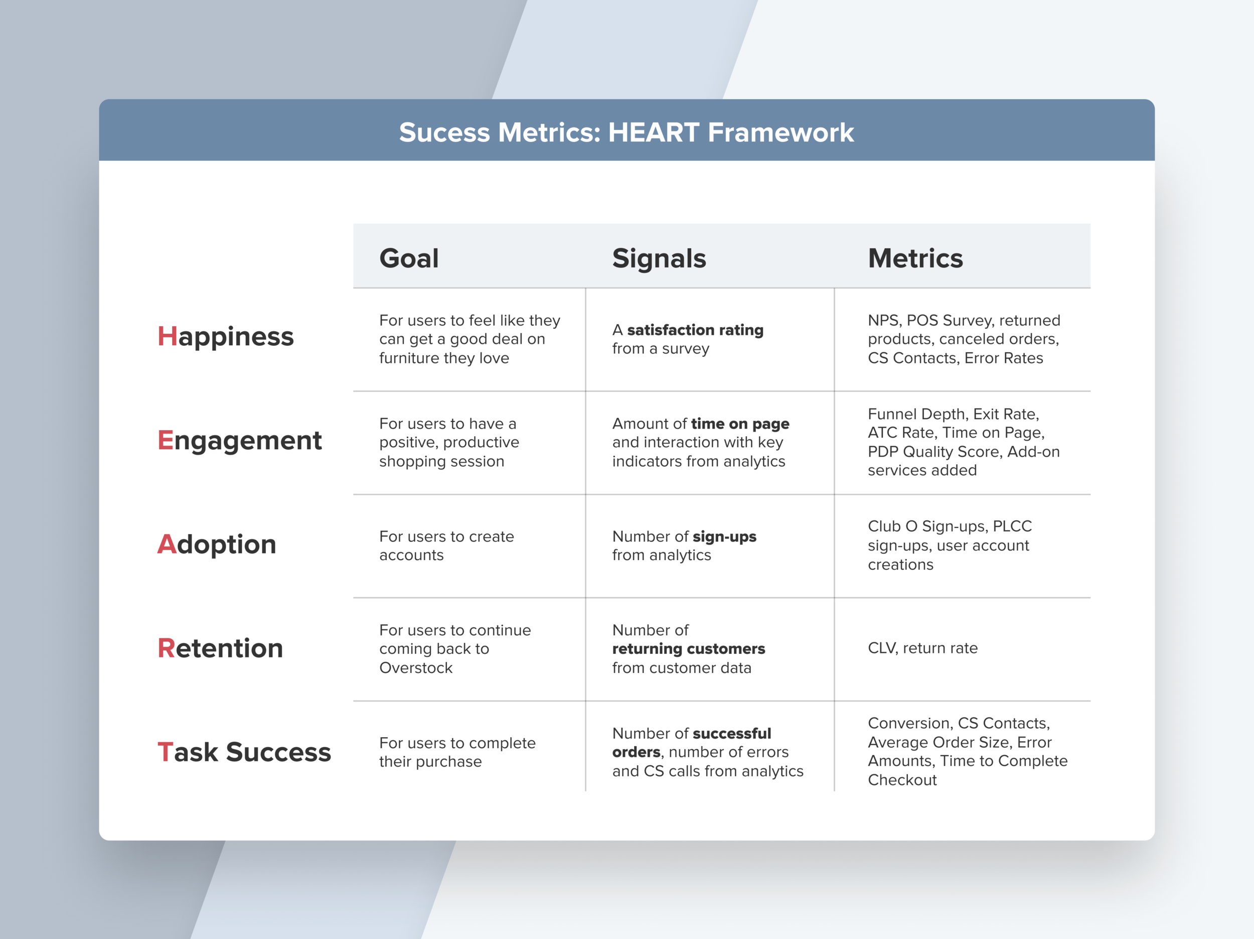
Prototypes of the new experience tested very well, so we moved on to A/B testing. We evaluated its success using the metrics listed above, using Google's HEART framework for determining success metrics. The new design is currently live on Overstock.com.